Enhancing Websites with Clear Visual Design
It’s no secret that I’ve spent longer on the aesthetic of this blog than I have on the content. I first created this website during a two-week-long effort to learn about web development over two years ago. Since then, I’ve toiled over the design of my posts and have become obsessed with visual design. I consider ways of maximizing the signal-to-noise ratio in everything I do.
Maximizing the signal-to-noise ratio is one of John-luc Doumont’s universal principles of design that he outlines in his book, Trees, maps, and theorems.
Maximizing the signal-to-noise ratio is one of John-luc Doumont’s universal principles of design that he outlines in his book, Trees, maps, and theorems.
As I’ve experimented with the layout of Caches To Caches, I’ve come to embrace one fundamental rule of effective communication:
Clarity is key.
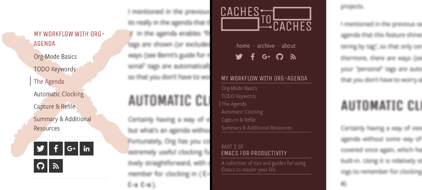
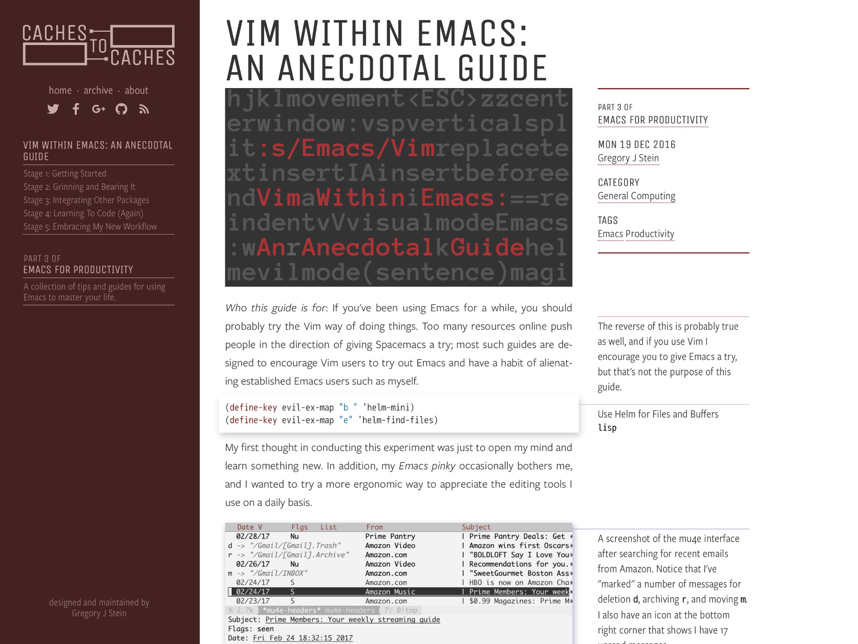
This sounds simple enough, but you’d be surprised how difficult it is to get this right. For example, the last version of this blog was filled with unnecessary clutter—particularly the left sidebar. By drawing the eye away from the margin notes on the right, the sidebar distracts us from the content without contributing much. Instead, the new sidebar, revealed only in the presence of excess screen space, is isolated by color and avoids causing confusion:

Here is a collection of guidelines I’ve come up with to help you emphasize your content and avoid needless distractions.
1. Ensure every element serves a purpose
If you haven’t worked out what your “goal” is, I suggest you do so. Only once you’ve considered what your purpose is in presenting content on your website can you design around that goal. For instance, I want the posts on this blog to serve as a repository for my niche interests and hobby projects, yet appeal to a relatively broad audience. As such, it is important to me that I include Tufte-style margin notes in my posts so that I can add additional thoughts and details I feel don’t belong in the main body text.
Keeping your goal in mind is important in other contexts as well. I’ve read dozens of scientific papers which have rambling “Methods” sections. Authors are understandably attached to their hard work, yet should refrain from including details irrelevant to their hypothesis.
Keeping your goal in mind is important in other contexts as well. I’ve read dozens of scientific papers which have rambling “Methods” sections. Authors are understandably attached to their hard work, yet should refrain from including details irrelevant to their hypothesis.
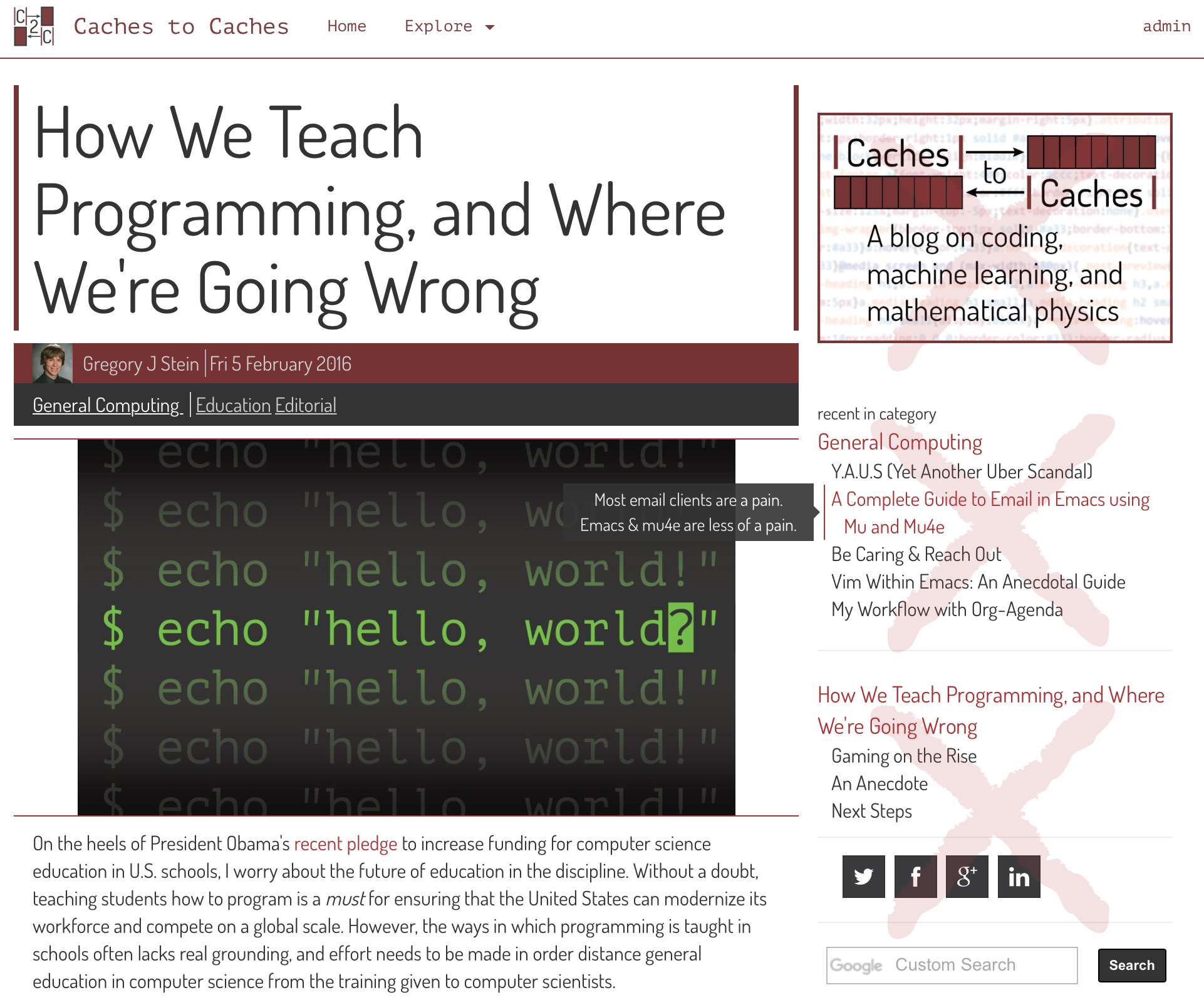
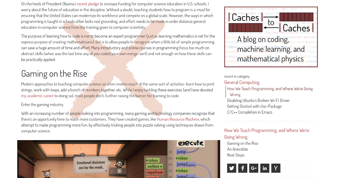
Everything that doesn’t serve this goal is a distraction. The aformentioned “sticky” sidebar is a great example of this—it’s neat to have a table of contents, but is mostly unnecessary. So too was my old static header, which contained a host of superfluous navigation elements. Sure it’s nice that a motivated reader could easily jump around the site and find old posts and related content. But for the average reader, it was just a waste of space, especially on the mobile version. On the first iteration of the site, I devoted so much of the top of the page to branding, headers, oversized titles and related posts that the post—the most important thing on the page—only began near the bottom of the screen:

2. Adhere to typographic norms
The most common typography sin I’ve seen on the web is text that is far too wide. This is especially true of websites without any dedicated styling, which allow the center text block to grow to the width of the screen. On my wide monitor, I have difficulty reading anything on sites like this, since I need to use my mouse cursor to keep track of which line I’m on.
I presume that, if you’re reading this post, you at least have some styling on your site, so please add a simple max-width check on your div elements if you haven’t already.
I presume that, if you’re reading this post, you at least have some styling on your site, so please add a simple max-width check on your div elements if you haven’t already.

Other considerations include font size, font color, and line height. For more inspiration in this regard, I recommend you inspect these properties on sites you think are well-designed or pick up a copy of the excellent The Elements of Typographic Style by Robert Bringhurst.
3. Create a coherent visual theme
A visual theme is more than just picking a color scheme. Small details like the thickness of borders or dividing lines should be uniform across the site, since anything which stands out could distract the reader. Even small differences in spacing between elements can be noticeable, so you should make an effort to match margins, line spacing, etc. CSS preprocessors like LESS and SASS allow you to define variables to make this process easier, so that you don’t need to slave over editing your style file every time you’d like to make a change.
Furthermore, prioritizing simplicity and clarity doesn’t mean removing everything aside from the content. However, any visual flair should have meaning as much as possible. For example, on blogs like mine which include code snippets, the code is frequently emphasized in some way. I’ve never liked having a distinct background color or a thick border line: both seemed too isolating. Instead, I use a light drop shadow around code snippets, an effect I also use for images. Doing this emphasizes that, while code and images appear with the content, they are distinct elements.

4. Experiment with styles
Don’t be afraid to experiment!
Even when I’ve had a pretty clear picture of what I wanted this site to look like, the first iteration would only get me halfway there. It is only through playing around with different style choices that I ever end up with something I’m happy with. The fonts on this site are just one example of this process. I toyed with hundreds of font combinations before I settling on what I have now. You should even consider purchasing fonts, since many professional font families are far superior to those you can get for free via Google Fonts.
I have a subscription to Adobe’s Typekit, which I rely on to serve most of the fonts on this page.
I have a subscription to Adobe’s Typekit, which I rely on to serve most of the fonts on this page.
Concluding Remarks
Though I’d like the content to stand on its own merits, some visual polish can make the difference between a closed browser tab and a captive audience. These are only a few ways I’ve found to better present the content on my blog: I’m constantly finding little tweaks that make the content shine. As you tweak your own website, remember the importance of clarity.
References and Inspiration
Of course, nothing happens in a vacuum. There are plenty of resources I’ve come across which have influenced my opinion on design, particularly the collected works of Edward Tufte, Trees, maps, and theorems, and The Elements of Typographic Style, all of which are phenomenal. I’ve also drawn some inspiration from beautiful websites, including the webpage for the exceptional Nautilus Magazine and Crafting Interpreters, an online textbook in which I first saw a horizontal border used to highlight marginalia. Finally, my experiences working with the EECS Communication Lab at MIT has been an invaluable influence as well.
